
Overview
This Python tool provides a lightweight workflow for generating genome‑wide CNV + BAF plots directly from DRAGEN CNV VCF and DRAGEN BAF files. It supports batch processing of multiple samples using a list of sample directories and produces publication‑quality PNG figures.
CNV + BAF plots allow investigation of allele‑specific copy number changes and LOH patterns. This article is a non‑technical explanation of the tool. Please see the README on GitHub project link below for details.
Why I Built It
Although many CNV and BAF visualization tools exist, only a limited number of people worked with DRAGEN. The DRAGEN output folder contains many files, and their contents are not always intuitive or well explained. As such, a tool that can operate directly on DRAGEN’s output folder, without requiring knowledge of DRAGEN may be helpful.
Example output
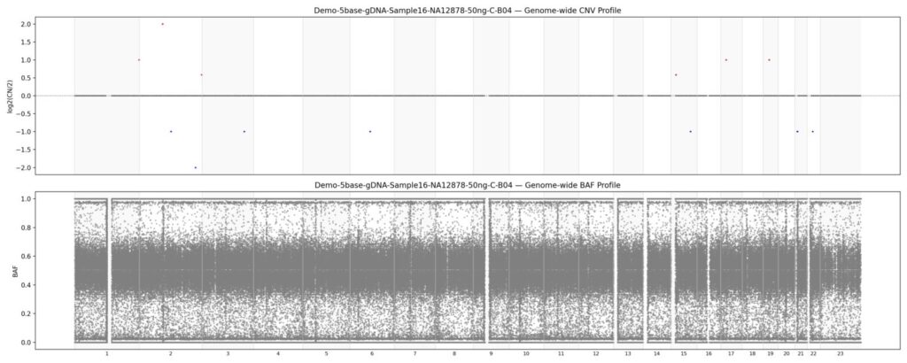
The example output above is generated from an ouptut of DRAGEN v4.4 5-base WGS demo data. The top and bottom plots are the CNV and BAF plots respectively. The tool also works for other pipelines, such as DRAGEN somatic and germline.
How to interpret the output
This demo sample contains no notable CNVs, so most of the features described here are not visible in the example. CNV‑neutral regions appear as a thick grey horizontal bar centered around 0 on the y‑axis. CNV gains appear as red bars above the grey CNV-neutral line, and CNV losses appear as blue bars below the CNV-neutral line. A typical BAF plot shows three bands at 0, 0.5, and 1, which the demo graph also displays. LOH occurs when the middle band at 0.5 disappears, leaving only the 0 and 1 bands. Copy‑neutral LOH shows a flat CNV profile but BAF bands only at 0 and 1. A heterozygous deletion produces a drop in CNV and BAF bands at 0 and 1, while allele‑specific gains create shifted BAF clusters (e.g., around 0.33 and 0.66).
Summary
DRAGEN output can be complex. This is a simple Python‑based CNV + BAF visualization tool that works directly from DRAGEN output files. Hopefully it can save some effort.